There are just too many iPhone cases in the world. I mean, we get it…they’re inexpensive to manufacture with a big markup, and the potential market is in the tens of millions with each new iPhone generation. Nearly everybody puts some kind of case on their phone because it’s just too easy to scuff, scratch, or shatter that thousand-dollar pocket supercomputer.
But what case should you buy? Are they all essentially the same, and you should just buy the one that looks the way you want at a good price? Or are some cases really truly better than others? We got a few dozen cases in to put them to the test, so we could recommend products based on more than just their web photos. So if you don’t see anything that strikes your fancy just yet, stay tuned because we’ll be adding to it as we test more.
Update 11/16/21: We’ve added four more case reviews to our roundup.
What to look for when buying an iPhone case
Obviously, the aesthetics of a case are critical. Really, your iPhone isn’t going to look like what Apple designed, it’s going to look like the case you stuck it in. But case design is a very personal thing, so we’re not going to pass judgment on it. You know what you like, right?
Aside from a case’s look, there are several other important factors worth considering. Here’s what we looked for with every case we tested.
Craftsmanship: We can’t really test longevity without using each case for several months at least, but we can tell you if it fits precisely, if the seams and gaps have tight tolerances, and so on.
Buttons/Cutouts: It’s surprising how many cases have really stiff and hard-to-press buttons, or whose buttons don’t line up exactly right. Cases with cut-outs instead of buttons need them to be the right size and shape for comfortable and reliable operation. And while it’s not technically a “button,” the cutout for operating the iPhone 13’s mute switch is of critical importance, as are the cutouts for the Lightning port and speakers.
Charging: Some cases (like wallet cases) aren’t even meant to work with wireless chargers, and that’s fine. But for those that are, we try it out on several wireless pads and stands to make sure they work reliably. We also make sure the Lightning port is easy to access no matter what cable you use.
With those test criteria in mind, here are some recommended iPhone 13 cases from the many we’ve tested, along with a few you should probably stay away from.
Standard cases
There are so many cases, with so many gimmicks and unique features, that it’s hard to say what a “standard” case really is anymore. For the sake of this roundup, this category is a catch-all for cases that don’t explicitly fit in the other categories. They’re not thin, rugged, or wallet cases, but they could have unique features like stands, integrated PopSockets, MagSafe magnets, and so on.
iPhone 13 Leather Case with MagSafe
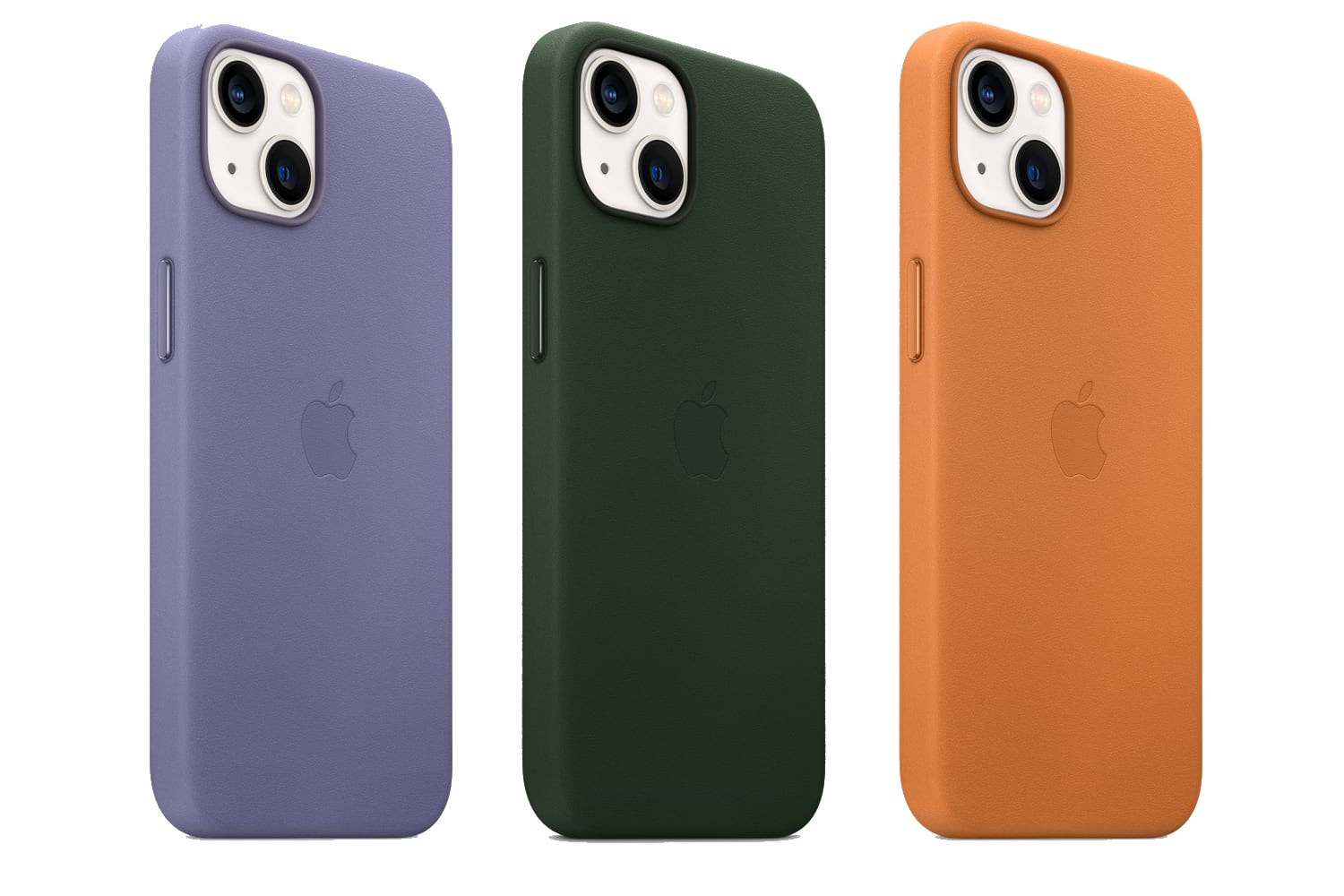
Craftsmanship: Apple sells three of its own iPhone 13 cases: this leather one, the Silicone Case, and the Clear Case. They’re all top notch, but a little pricey. The leather case is nicest, if you don’t mind real leather. It doesn’t feel “too leathery”…there’s a nice firmness and rigidity to it. And over time, the wear will make it look even better. You can’t go wrong with the official Apple cases, but they’re not specialized–neither ultra-thin nor extra rugged, and with no special features other than MagSafe.
Buttons: The buttons work flawlessly, retaining the full clicky feel and even the size and shape of a naked iPhone’s buttons. The mute switch cutout is quite small, but tapered and perfectly positioned, so it’s not hard to use. The only real problem is that the cutout for the Lightning port can be a bit of a tight fit on the larger third-party Lightning connectors.
Charging: We had no problem with any wireless chargers we tried using Apple’s cases, with the obvious exception that the huge camera bump on the iPhone 13 Pro and Pro Max can sometimes get in the way. All Apple’s cases support MagSafe, meaning that they have a ring of magnets in them to help MagSafe accessories stick on tightly.
Spigen Ultra Hybrid S

Craftsmanship: Spigen sells several cases with “Ultra Hybrid” branding–a plain one, one with MagSafe, and this one with a built-in stand. They’re all quite similar. They’re thin but not excessively so, and clear with optional colored bands. The fold-out stand seems fairly well built and snaps in and out with a satisfying click. It’ll hold your iPhone 13 up reliably in either orientation.
Buttons: The buttons all work reliably. They have a little bit of a spongey feel (as most clear plastics seem to), but they’re not too stiff. The cutouts for the mute switch, speakers, and Lightning port are all aligned well and sized right.
Charging: The model with the stand won’t really work right with most wireless chargers unless it’s small enough to fit between the stand and the camera bump. The other Ultra Hybrid models we tested work fine with every wireless charger we tried, and the MagSafe model has nice strong magnets.
Smartish Gripmunk with MagSafe
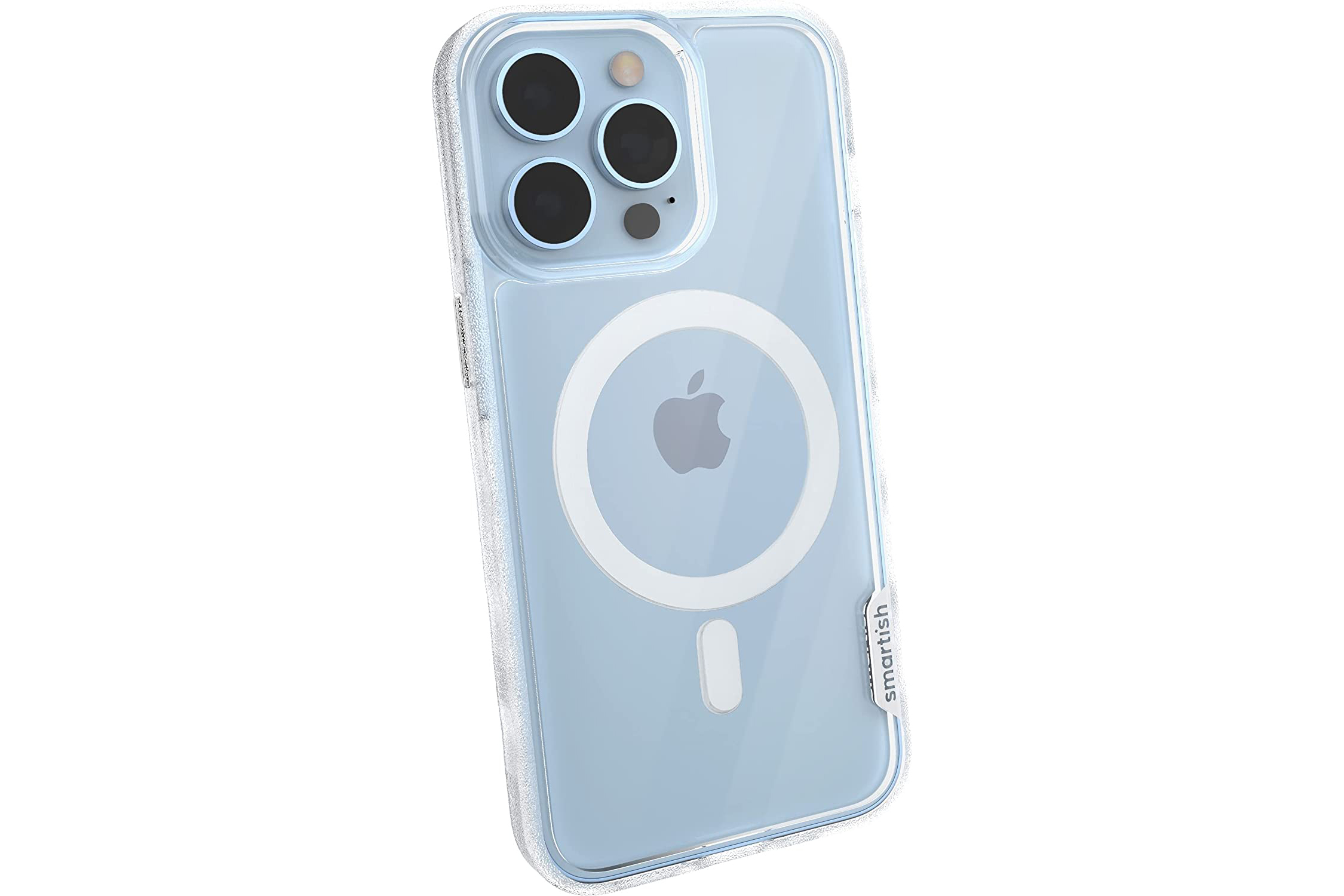
Craftsmanship: An alternative to Apple’s Clear Case that is in some ways better than the official Apple product, and certainly less expensive. It’s not quite as finely crafted as Apple’s own case but fits really well, and the textured sides make it a lot easier to grip. The Gripmunk case comes in a variety of colors, and you can get it with or without MagSafe, but it’s the clear one (“Nothin to hide”) with MagSafe that stands out, in part because Apple’s Clear Case has such a stiff feel and slick texture. And it’s half the price.
Buttons: The buttons work fine. They’re easy to locate by touch and not hard to press, though you lose a little of that “click” feel compared to a naked iPhone. The cutout for the mute switch is just slightly off-center but not enough to affect its use, and the cutouts for the Lightning port and speakers are generous.
Charging: MagSafe attraction is rock solid, and we had no problems using any wireless charger in our test suite. This case is technically “MagSafe Compatible” and not “Made for MagSafe” but all that means here is that you don’t get the little animation when you first put the case on your iPhone.
Presidio2 Grip Compatible with MagSafe

Craftsmanship: Speck is one of those brands you can reliably find in many retail stores, but you might want to expand your search a little. This case is okay, but feels a little chintzy for something that costs at much as Apple’s official cases. The whole thing feels like low-grade plastic, and the lip on the top edge halfway covers the earpiece hole because Speck didn’t make a little cutout there as many other manufacturers do. For the price, you should expect more.
Buttons: The buttons are well-positioned, feel good, and are easy to click. The speaker and Lightning cutouts are fine, but the cutout for the mute switch is badly misaligned. You can operate the switch, but it’s not what you’d expect from a premium-priced case.
Charging: This case is MagSafe Compatible (not “Made for MagSafe“) so it adheres strongly to all MagSafe accessories and chargers. We got a good solid charging connection with all the wireless chargers we tried, and had no problem getting any of our third-party Lightning connectors to fit.
Incipio Organicore

Craftsmanship: This is a relatively plain case, perfectly average in size and shape. Its claim to fame is that it is made from 100% vegetable-based plastic and is fully compostable (in industrial composting facilities, not your backyard compost pile). The fit is okay, and it has an interesting look; sort of faux-distressed as if to emphasize its “green” cred. But there’s not a lot interesting or unique here beyond the environmental aspect. The raised edge around the screen isn’t thick enough to obscure the top earpiece speaker.
Buttons: The side button is too stiff, but the volume buttons depress easily and retain their clicky feel a bit. The cutouts for the mute switch, speakers, and Lightning port are positioned properly and sized well.
Charging: We had no problems getting a good charge on any of our wireless chargers, and all our third-party Lightning connectors fit just fine.
Coach Protective Case

Craftsmanship: You’re paying a big premium for the Coach branding on what is otherwise a rather mediocre case. The glittery, shiny floral pattern is nice enough if that’s your thing, but the case is just basic clear plastic. It’s awfully stiff, feels cheap, and doesn’t seem like it’s going to do a whole lot to absorb impact if you drop your iPhone on its edge.
Buttons: The button areas are very slim and low-profile, but the stiff plastic makes the buttons stiff and hard to press. The cutouts are well-positioned and sized, though.
Charging: It worked well on a good wireless charger, but was a little touchy trying to get a good connection on a less-powerful wireless charger. The Lightning port cutout is big enough to easily accommodate all our third-party cables.
Grip2u Silicone
Craftsmanship: This whole case is made out of a nice soft-touch silicone, with a felt-like material inside to protect the back glass of your iPhone 13. It feels good and seems well-made, but the whole gimmick here is the thin silicone strap on the back. Slide a finger or two in there to act as a grip for easier one-hand operation, similar to a PopSocket or any of the many other iPhone grips. It’s surprisingly comfortable. The case comes in black and blue, but replacement bands come in a variety of colors and styles (and cost a reasonable $6).
Buttons: The buttons are aligned properly, easy to press, and retain the clicky feel of a naked iPhone. The cutouts for the mute switch and speakers are positioned and sized well.
Charging: I was shocked to find I got a good connection with all my wireless chargers, when it seems like the grip band (thin though it may be) might interfere. You can’t use MagSafe, though. Unfortunately, the cutout for the Lightning port is just a little bit too smaller than I would like. Apple’s official cables, and many third-party cables, fit with no problems, but the largest Lightning plugs are a bit of a tight fit.
Incipio Duo

Craftsmanship: This is a pretty basic case, and it feels like it. It’s not poorly made, but it certainly has a pretty basic plastic feel to it. One interesting design choice is the inclusion of little “feet” on three of the back corners, which feel slightly awkward in the hand but allow the phone to sit level on a desk instead of wobbling from the big camera bump. Note that Incipio makes two versions of this case, one without MagSafe and one with (that costs $10 more).
Buttons: The power and volume buttons are too stiff and don’t have much travel to them, and the cutout for the mute switch is a bit off-center. It’s functional, but doesn’t feel high-quality.
Charging: I had no problems getting a decent connection on any wireless charger I tired, and the cutout for the Lightning plug is generous enough to easily fit larger third-party cables.
Case-Mate Twinkle
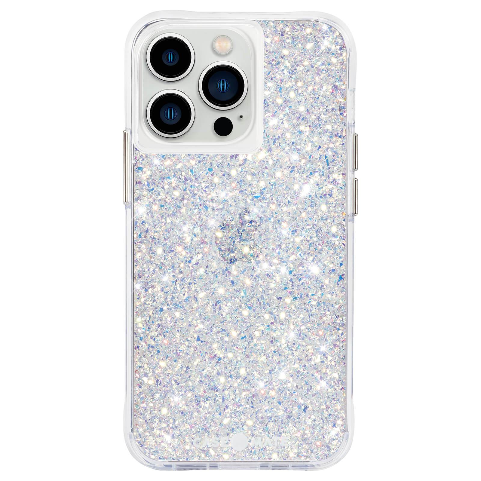
Craftsmanship: If I’m honest, most of the Case-Mate designs are way too gaudy for my personal tastes, and that includes the “Twinkle (Stardust)” reviewed here. But there’s definitely a market for this stuff, and Case-Mate cases are easy to find at lots of retailers. Maybe it’s because it’s made with plant-based materials, but the plastic feels hard, unforgiving, and cheap. And the fit isn’t very precise. For example, the camera cutout has squared, instead of rounded, corners.
Buttons: The buttons protrude quite a bit and are very easy click, but the cutout for the mute switch is way out of alignment, to the point where it’s difficult to operate.
Charging: I did’t have any trouble with any of my good wireless charging stands, but some of the lesser ones were hard to get a good connection with. The Lightning port cutout is quite large, and shouldn’t get in the way of larger cables.
Mous Limitless 4.0
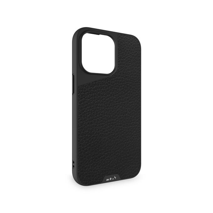
Craftsmanship: This is a very well-made case, if not particularly special. It fits well, it’s comfortable in the hand, it looks good. I can’t figure out why it’s $60, though. Yes, MagSafe compatibility adds a bit of cost, and everything about the design and build quality is on point, but there’s nothing about the construction or materials that would necessitate this kind of pricing.
Buttons: The buttons are clicky and responsive, and the cutout for the mute switch, speakers, and charge port are aligned and sized properly. It’s just as it should be.
Charging: I didn’t have any problems using any wireless charger, and MagSafe accessories attached well.
MOFT Snap Phone Case

Craftsmanship: MOFT is known mostly for its fold-out stands and wallet accessories, but their basic MagSafe Snap case deserves your attention. It’s well-made overall, and claims double-strong MagSafe magnets–in my testing, it definitely adhered much more securely to all my MagSafe accessories. It’s a fairly basic case, but if you use MagSafe stuff, you’ll appreciate how strong the magnets are.
Buttons: The buttons are workable without too much trouble, though the volume buttons are a little stiffer than the side button. The oval cutout for the mute switch is lined up well, but a little on the small side.
Charging: Works well with all my wireless chargers and lightning cables. But more importantly, the extra-strong MagSafe magnets do make a real difference.
Thin cases
A super-thin case is all about adding as little bulk and weight to your iPhone 13 as possible. The iPhone 13 is a heavy phone, especially the Pro models, so you’d be forgiven for not wanting to make it heavier still. A thin case necessarily offers only minimal drop protection; they’re really made to function as a sort of “skin” that’s easy to take on or off, saving your expensive phone from scuffs and scratches. Thin cases have the benefit of working great with wireless charging (usually), but on the iPhone 13 Pro you’ll see a pretty big lip around that huge camera bump, which can get in the way a little. Some are even so thin that they barely interfere with MagSafe accessories, despite not technically being “MagSafe compatible.”
Totallee iPhone 13 Pro Case

Craftsmanship: Totallee makes some of our favorite ultra-thin cases. They’re precision cut to fit well, but don’t have any sharp edges. Cutouts for the silence switch, speakers, and Lightning port are just right. Super-thin cases don’t afford a lot of drop protection, but they’re great for keeping scratches and scuffs off without adding a lot of bulk.
Buttons: Button action is perfect. You still get that clicky feel and don’t have to exert any extra pressure.
Charging: As a super-thin case, there’s a significant lip around the camera bump, especially on the iPhone 13 Pro models. There has to be. That can get in the way of some charging stands or mounts, which is more Apple’s fault than Totallee’s. Otherwise, they’re so thin as to not interfere with wireless charging at all. We were even able to use some MagSafe accessories well because the case is so thin, despite these not being Magsafe-compatible cases.
Spigen Liquid Air
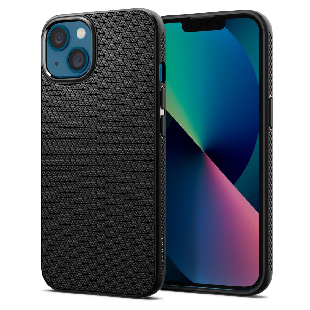
Craftsmanship: This straddles the line between a standard-size case and a “thin” case. Spigen says it has “air cushion technology” to help protect your iPhone from drops, but let’s face it, no case this thin is going to offer really great drop protection. The grippy back is nice, but the edges of that back pattern aren’t as smooth as they could be. The main draw here is that this is a super affordable case, and for the price, it’s not half bad. The top lip of the case partially covers the earpiece, though not enough to have an impact on how it sounds.
Buttons: The buttons on this case have slits cut along the edges, making them quite easy to depress. The cutouts for the mute switch, speakers, and Lightning port are well-proportioned.
Charging: Works fine with every wireless charger we tried, though as with most thin cases, the substantial lip around the camera bump can make placement tricky on some chargers or stands. However, this case isn’t quite thin enough to work with MagSafe accessories.
Spigen Thin Fit

Craftsmanship: Spigen’s Thin Fit is the same affordable price as the Liquid Air, but we like it a little better and it comes in more color options. The smooth finish feels better in the hand, and the case is even thinner and more comfortable to hold. The upper lip has a little near-imperceptible groove cut to make sure the earpiece isn’t obstructed, which we appreciate. Our one complaint is the slight seam running down the sides where the colored back piece meets the matte black front piece.
Buttons: Like the Liquid Air, the buttons have cutouts along the sides that make them easier to press, and the cutouts for the mute switch, speakers, and Lightning port are positioned and sized well.
Charging: No problems working with any wireless charger we tried, outside of Apple’s huge camera bump occasionally getting in the way. This case is thin enough that some MagSafe accessories held fast, which you can’t really say about the Liquid Air.
Moshi iGlaze XT
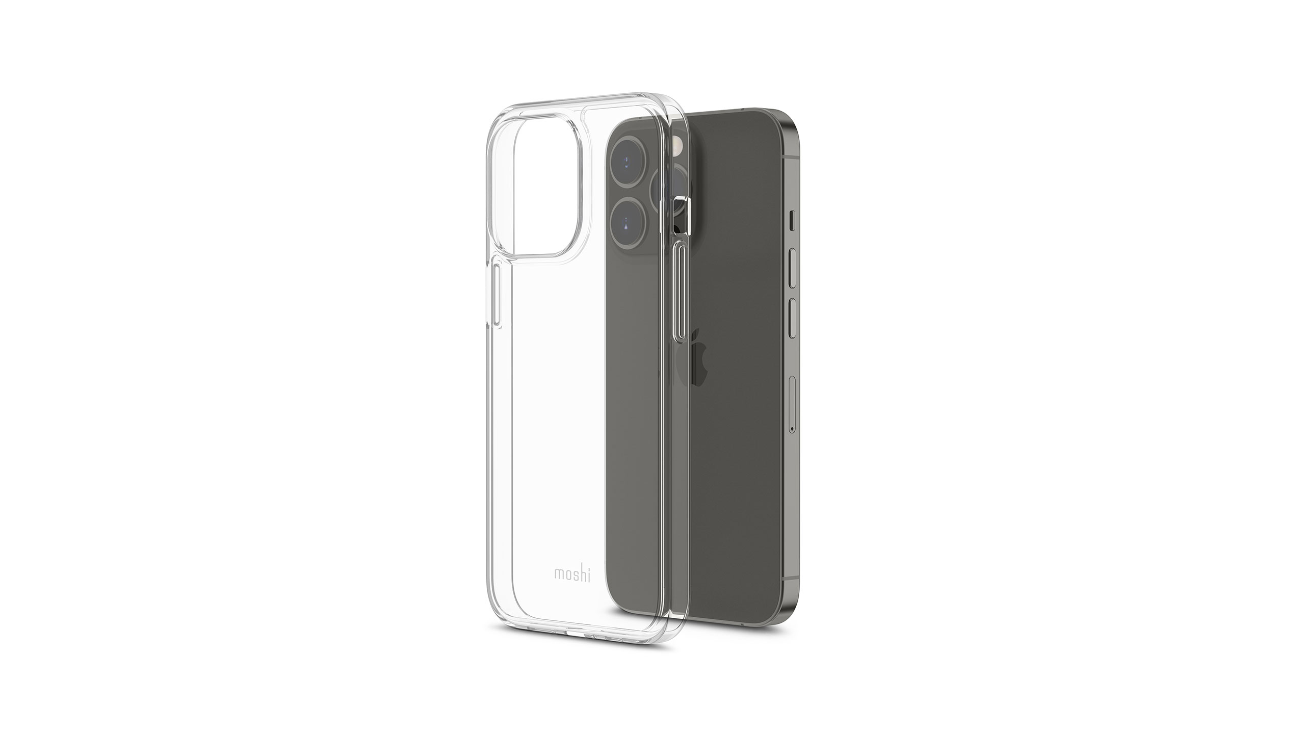
Craftsmanship: Most of Moshi’s “iGlaze” thin cases are part of their SnapTo proprietary magnetic mounting system. Unless you have a lot of those accessories already, we suggest you avoid them in favor of the broader MagSafe ecosystem. The iGlaze XT, however, is a nice thin clear case with no SnapTo or MagSafe magnets at all. It’s fairly thin, glossy, clear, and well-made with a precise fit. The SnapTo iGlaze cases are considerable thicker.
Buttons: Nice clicky, easy-to-press action on all buttons, and the cutouts for the switches and ports are all perfectly aligned and sized well.
Charging: We had no issue with any wireless charger or third-party Lightning cable. Some thin cases are slim enough for MagSafe accessories to attached securely, but this one is just a little too thick to get a solid stick.
Rugged cases
If you’re especially rough on your iPhone, you probably want a rugged case. These are ideal for people who work in rough environments, but they’re useful for anyone who drops their phone a lot, or has a nosy and rambunctious toddler, or goes fishing all the time, or puts their phone in situations where it could break easily.
Rugged cases are often thick and bulky, and therefore you can expect them not to work very well with most wireless chargers, if they work at all. Button action is also especially important in these cases, as the thicker designs often make buttons stiff and hard to press.
Spigen Tough Armor

Craftsmanship: Another Spigen case we’re not big fans of. It’s more “tough-looking” than actually tough. The back looks like metal, but that’s just plastic. The little flip-out kickstand is a chintzy piece of plastic we could easily bend, and will almost certainly snap off or crack in due time. And what’s the point of a rugged durable case with a huge hole in the back to show the Apple logo? I’m sure a case this thick offers nice impact resistance, but it doesn’t seem very well made.
Buttons: The rubberized buttons work surprisingly well for such a thick case, but we can’t get over how badly misaligned the cutout for the mute button is.
Charging: The Lightning port cutout is big enough for even larger third-party cables. And while most ruggedized cases don’t work with wireless chargers, this one actually did work with a few of our better ones, thanks to the fact that it only looks metallic but is actually all plastic. I’m sure the big hole around the Apple logo helps, too.
Gripzilla

Craftsmanship: This is not quite a big and thick as some other rugged cases, but that’s not necessarily a bad thing. The scalloped and textured sides give you a serious grip, and there’s enough heft here to provide good drop protection. The front lip is substantial, with a cutout on the top edge so as not to block the top earpiece. The whole case has a slightly sandpapery texture that really does make it easy to grip even with wet or messy hands.
Buttons: Somehow, this thicker case has buttons that feel less stiff than Smartish’s other cases. They have a nice distinct and clicky feel. Cutouts for the mute switch, Lightning port, and speakers are generous.
Charging: This is a MagSafe compatible case, which means it has a ring of magnets in the back to make MagSafe accessories adhere strongly, and they really work great. We got a pretty solid wireless charging connection to all the chargers we tested, too.
Raptic Shield

Craftsmanship: Raptic says their case is tested to withstand 10-foot drops onto concrete, a claim we’re not about to try verifying. But the case is quite rigid and has an aluminum frame with a rubber “bubble” pattern on the inside edges, and the clear plastic back is rigid and hard. It’s not as bulky as some other ruggedized cases but definitely adds considerable heft to your iPhone 13.
Buttons: The thick sides with generous spacing are great for shock absorption but make it hard to do good buttons. They’re only slightly stiff, but the little dimple isn’t enough to easily find the button locations by touch. They’re lined up well, and the cutouts for the mute switch, Lightning port, and speakers are generous.
Charging: The back is just clear, rigid plastic and doesn’t interfere with most wireless chargers. But it’s a little thick, and finicky or weak chargers had trouble finding good alignment. If you have a good wireless charger, you’ll be fine. Third-party Lightning connectors that are larger than Apple’s had no problem with the generous cutout around the port.
Wallet cases
In an increasingly tap-to-pay world, there’s less reason to carry around a bunch of stuff in your wallet. Apple’s even making state IDs and driver’s licenses available in iOS 15 (in supporting states). If you only need to carry around a couple of cards, a wallet case case be a great idea. Yeah, these tend to be bigger and thicker cases, but that can be a small price to pay to not carry around a separate wallet.
Almost none of these cases will work with wireless chargers. They’re too thick because of the card holder, and they need magnetic protection to stop the MagSafe magnets in the back of your iPhone 13 from messing up the magnetic strip on your credit or debit cards. Their added bulk makes button action especially important, much like rugged cases.
Note that we’re not covering MagSafe wallet attachments here, only fully cases that have wallet or card-carrying features. If you want a sometimes-wallet, perhaps a MagSafe compatible case and wallet sleeve attachment is a better choice for you.
Spigen Slim Armor CS

Craftsmanship: Spigen typically makes pretty good products, but they blew it with this one. This is supposed to be a “slim but rugged” case with a slide-open compartment on the back to hold two or three credit cards, IDs, or a few folded-up bills. But the sliding compartment is a little chintzy, and worse, there’s only a thin piece of rubber separating it from the back of your iPhone. The back of your iPhone that is full of magnets. If you put a credit card in this case, you’re just begging for the magnetic strip to be erased. Yikes. We don’t live in a chip-and-pin card-only society yet; this is a huge design failure.
Buttons: As it does on some other cases, Spigen has cutouts along the sides of its buttons to make them easier to press. And the cutouts around the mute switch, speakers, and charge port are on point.
Charging: As you might expect, this case doesn’t work at all with wireless chargers. The Lightning port is unobstructed, though.
Smartish Wallet Slayer vol. 1

Craftsmanship: Smartish sells two versions of this case: Vol. 1 with a smooth hard back and Vol. 2 with a textured pocket. They both hold about four cards (or maybe three and a bit of cash) in a nice sleeve that holds cards securely but makes them easy to remove. They fit the iPhone 13 well, with a cutout on the top lip so as not to block the top speaker. There’s a critical flaw in both of them, though–there’s nothing but a thin strip of slicone between the cards and your iPhone 13, which is loaded with magnets. You’re begging for your card’s magnetic stripe to be erased if you use this thing. Maybe they should have called it “Card Slayer.” It’s a shame, because it’s otherwise a decent case at a good price. If you only plan to use cards with no magnetic strip (or cash), it’s not a bad choice.
Buttons: The buttons are slightly stiff, but it’s not nearly the worst we’ve seen. The cutouts for the mute switch and Lightning port are generous and centered well.
Charging: As with most wallet cases, there’s just too much material in the back to work well with a wireless charger and you definitely should not even try to use it as such with credit cards inserted.
Smartish Dancing Queen
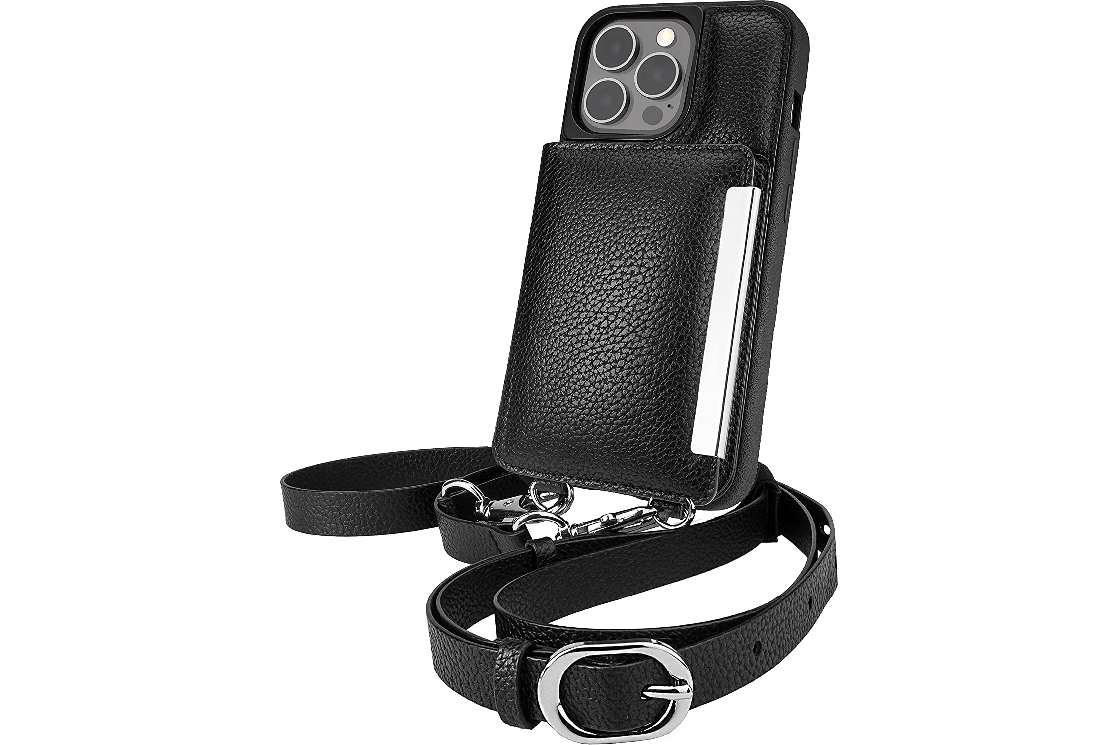
Craftsmanship: You probably shouldn’t expect too much from a $30 case that has a whole wallet and wrist strap and body strap, but Smartish’s unique Dancing Queen is slightly better built than you’d think. Of course, nothing here even remotely resembles real leather, but it fits your phone well, and the flap to hold your cards and cash (up to five cards plus a few bills) is sized right and works well. There doesn’t appear to be any protection from your iPhone 13’s ring of magnets, so it could erase the magnetic stripe on any cards you put in there, but there’s a bit more material than in some other wallet cases. Still, it’s impossible to recommend a wallet case that isn’t shielded to protect magnetic stripes on cards.
Buttons: The buttons are a little on the stiff side, but still work reliably. The cutout for the mute switch is large enough to operate it easily.
Charging: This wallet case has even more wallet slapped onto the back than most, so wireless charging is definitely going to work–even when there are no cards in it.
Vena Legacy

Craftsmanship: This sturdy case has a flap on the back that holds two cards, or can serve as a kickstand of sorts. The flap holds closed with magnets, and blocks RFID signals. So far so good, but the case has MagSafe-compatible magnets in the back, and doesn’t appear to do a very good job shielding cards in the card flap from them. So this could be great for IDs or chip cards, but I’d be worried about putting a metro card with a magnetic stripe in there. It’s a little disappointing in a case this bulky.
Buttons: The buttons are clicky and responsive, despite the relative bulk of the case. The cutout for the mute switch is positioned and sized well.
Charging: With the card-flap open, it works well with wireless chargers and even sticks securely to MagSafe devices. The Lightning port cutout leaves room even for larger third-party cables.
Moshi Overture
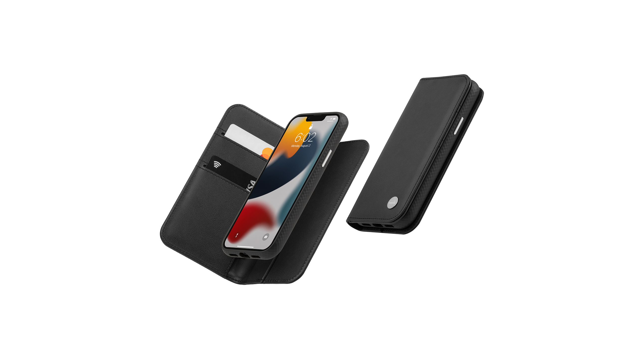
Craftsmanship: This vegan leather case lets you magnetically attach your iPhone, in a case, inside a larger wallets that can hold a few more cards and bills that the typical snap-on back wallet. The wallet feels pretty good and it’s nice to quickly and easily leave it behind if you like, but note that this is not a MagSafe case. It uses Moshi’s proprietary Snap To system. That’s not a problem as you get the case and wallet together, but it does limit your options for other accessories.
Buttons: The buttons are distinct and easy to press, and the mute switch cutout, while not very large, is aligned well. Note that the cutouts for one set of the speakers on the bottom edge aren’t quite lined up right, but it doesn’t affect the sound quality very much.
Charging: This works fine with any wireless charger I tried and the Lightning cutout is big enough for larger third-party Lightning cables. But the Snap To magnetic system makes this incompatible with MagSafe.
from Macworld.com https://ift.tt/3DF8Fiq
via IFTTT