Before we start, I have a confession: It’s been about 10 years since I bought a MacBook. I’ve used plenty of them over the years through work and on loan from Apple, including the latest M1 MacBook Pro, but the last time I actually owned a MacBook was the 15-inch MacBook Pro with Retina display in 2012.
So when I saw a recent deal on the entry-level 14-inch MacBook Pro at Costco, it was too good to pass up. Even though I had read the reviews, I didn’t expect all that much to be different between the M1 MacBook Pro and the M1 Pro MacBook Pro—a little faster, a little bigger, a little newer. But I was pleasantly surprised. The 14-inch MacBook Pro is a whole new machine that’s far more than just a faster version of the M1 MacBook Pro.
The extra inch makes a huge difference

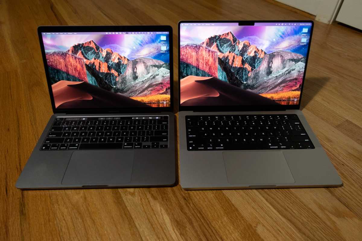
The 14-inch MacBook Pro is less than an inch bigger than the 13-inch model but it feels much bigger than that.
Michael Simon/IDG
I never had a problem with my 13-inch MacBook Pro. I’ve gradually downgraded my laptop’s display over the years—17 inches to 15 inches to 13 inches—as I rely more on an external monitor, so I didn’t think much about the size of the new MacBook. It’s not even a full inch bigger than the M1 MacBook Pro (13.3 inches vs. 14.2 inches), but it makes a massive difference. Thanks to the smaller bezels, the screen feels much larger than 14 inches and downright massive compared to the 13-inch model. The rounded corners and slim bezels help give the screen a more immersive feel making the extra nine-tenths of an inch feel more like three inches. I’ve used my external display a lot less since switching, and no longer feel tethered to my desk.
The notch isn’t noticeable at all

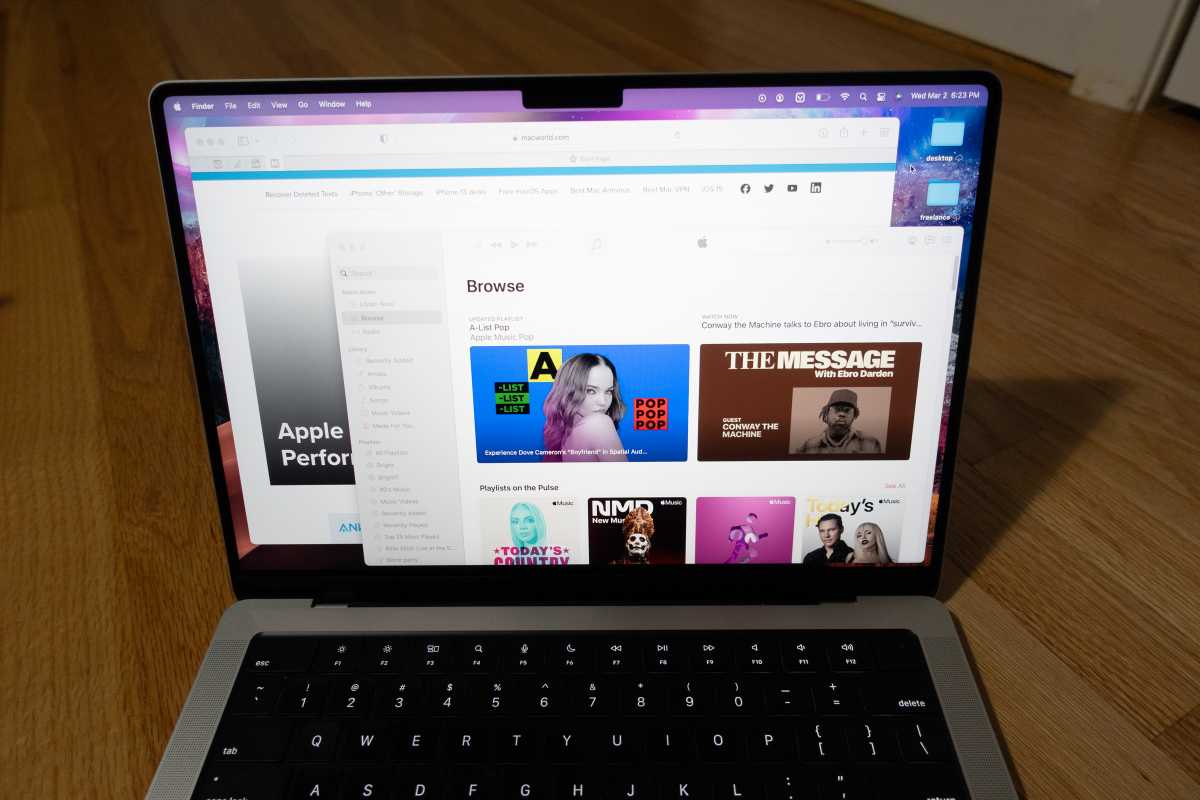
The notch on the 14-inch MacBook Pro is more noticeable in pictures than in practice.
Michael Simon/IDG
I’ll admit that I was taken aback when I first saw the notch on the MacBook Pro. Visually jarring in photos and seemingly unnecessary without Face ID, the notch was my biggest fear of the new MacBook, especially after dealing with it on the iPhone. But on the MacBook Pro it’s absolutely a non-issue. It’s so high up on the screen I don’t notice it unless I look for it, even when using “Light” mode. I still wish there was a TrueDepth sensor in there for Face ID, but the notch is a very small price to pay for such remarkably skinny bezels.
Everything is a whole lot faster
On paper, my old and new MacBook Pros are quite similar. Both have an 8-core processor, 16GB of RAM, and 512GB of storage. But they couldn’t be more different. The M1 on the 13-inch MacBook Pro is a plenty capable chip, but the M1 Pro absolutely screams even in its cut-rate state (compared to its 10-core siblings). The two extra high-performance cores (six in the M1 Pro versus four in the M1) are doing a ton of work, and the whole machine feels much much faster all around.
While the 8-core M1 Pro dutifully handles the M1, it’s also no march for the 10-core M1 Pro, as expected. But in real-world day-to-day use I can’t imagine needing much more speed. Maybe the extra performance will become more apparent after a year or so of use or if I need to do something taxing, but for my money, the entry-level model is plenty good and outshines the M1 even in my normal use, which are largely single-core tasks.
The gap is even more pronounced with the GPU. I’m not a gamer by any stretch so the increased frame rates and response time of the M1 Max wouldn’t mean as much to me, but I’m very impressed with the M1 Pro’s 14-core GPU. As the benchmarks show, the M1 Pro’s GPU basically laps the M1. It’s clearly handling tasks much better than the M1, and graphical elements fly around the screen.
The display quality helps, too. Apple has moved to an XDR ProMotion display on the newest MacBook Pro and the improvement is palpable. The screen is significantly brighter, but more important, the higher refresh rate makes scrolling and animations feel very smooth. I’ve read the MacBook Pro display is particularly bad with motion performance, so I was prepared for the worst, but my eyes haven’t experienced anything jarring (like I said, I’m not a gamer). The experience has been nothing but pleasurable—except when I need to switch back to the 13-inch MacBook for work.
I actually kind of miss the Touch Bar

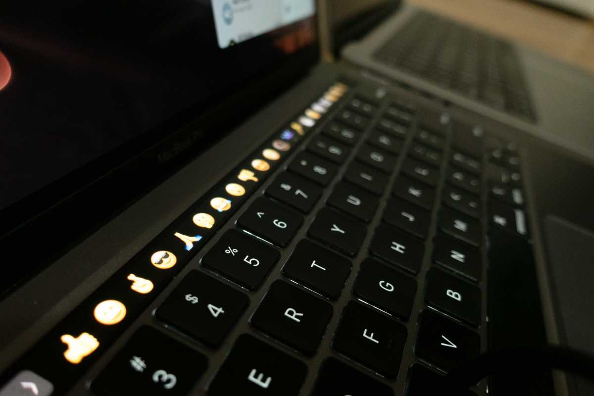
I never thought I’d miss the Touch Bar—but I do.
Michael Simon/IDG
I can’t believe I’m writing this, but I never realized how much I actually used the Touch Bar on my 13-inch MacBook Pro. I complained about it regularly over the years, but I honestly miss it on the 14-inch model. It’s not all the time, but the Touch Bar was incredibly useful in some instances—the volume and brightness sliders, screenshots, filling in forms, picking emoji—and I instinctively reach for it several times a day. They say you don’t really appreciate what you have until it’s gone, but I never expected to feel that way about the Touch Bar.
It feels like Apple’s first pro laptop in years

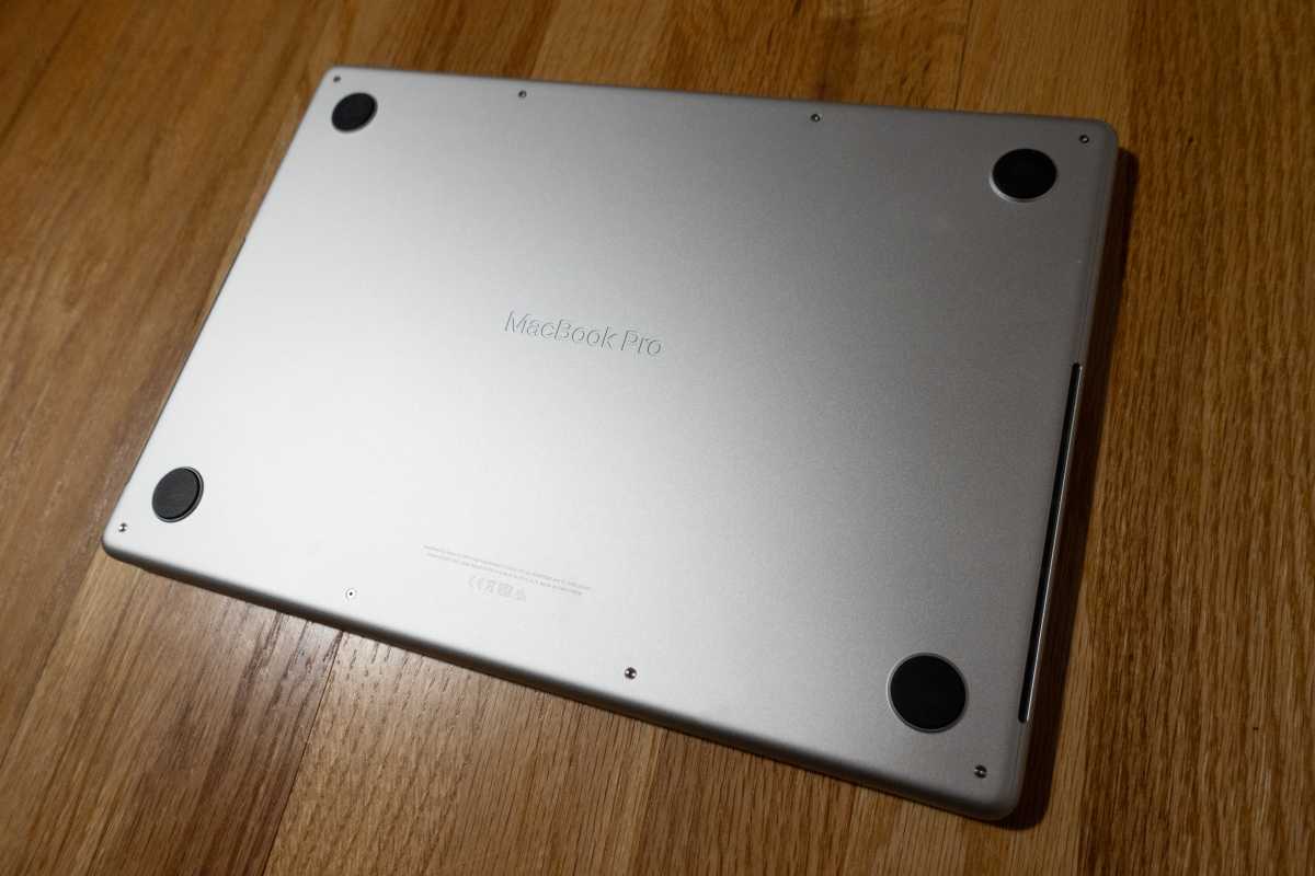
Even on the bottom, the 14-inch MacBook Pro has an incredible attention to detail.
Michael Simon/IDG
I’ve used Apple’s pro laptops since I bought my first Titanium PowerBook G4 in 2001. But the 14-inch MacBook Pro feels like a true professional laptop for the first time in years. I hadn’t realized just how homogenous Apple’s notebooks had become, but from the ports to the display to the processor, there’s a clear difference between this laptop and every other model Apple sells.
It might look the same at a glance, but there are meaningful changes to the design that make it feel like a higher-end device: the embossed name and heat vents on the bottom, the shaper edges, the all-black keyboard well, even the click of the trackpad all feel upgraded from the model released just 16 months ago.
from Macworld.com https://ift.tt/VC6gJxB
via IFTTT


0 Comments