WWDC is just a couple of months away. Unless there’s a dramatic break from tradition, Apple will preview its new operating systems—iOS 16, iPadOS 16, macOS 13, tvOS 16, and watchOS 9—while highlighting all the biggest features and design changes they bring during the keynote event on June 6 at 10am PT. While those of us who follow Apple closely always get excited about new hardware, these major operating system updates are a big deal—the digital lives of over a billion people can shift dramatically by what Apple chooses to do with its software.
As we do every year, we’re going to highlight some of the areas we hope to see Apple address in its next big yearly update. (See our iOS 15 wishlist from last year.) It’s not as if Apple makes its decisions based on what we say, or would have time to implement these features before its big developer conference, but the discussions that brew from these suggestions are a productive part of improving the devices that so profoundly influence our lives. With that in mind, here are some of our top desires for iOS 16.
Interactive widgets
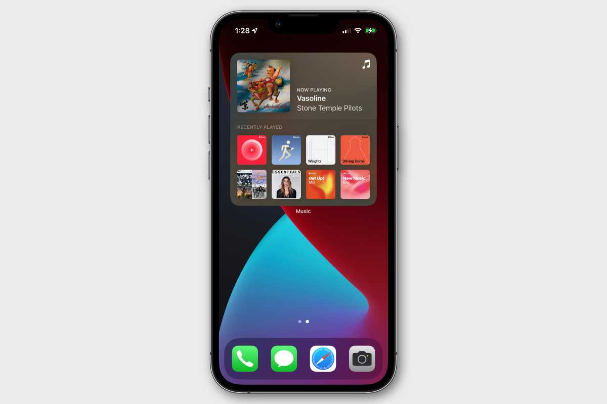
With iOS 14, Apple completely overhauled widgets. They look great, feel more standardized, and can now appear on your home screen, mixed in with app icons.
But they lost something important at the same time: interactivity. Widgets can visually update with new info, but if you tap on it, you open the associated app. Gone is the ability to tap a button or slider on a widget and actually do something.
This is especially frustrating in the case of apps like Apple Music, whose controls work right from the widget on Android and don’t do anything but open up the app on iOS.
Obviously, some safeguards need to be in place. The framework for interactive widgets will have to make sure you don’t do something like turn off your home alarm with an accidental tap. But there’s plenty of room for widgets with simple controls to do useful things without jumping into apps all the time.
IDG
Always-on display
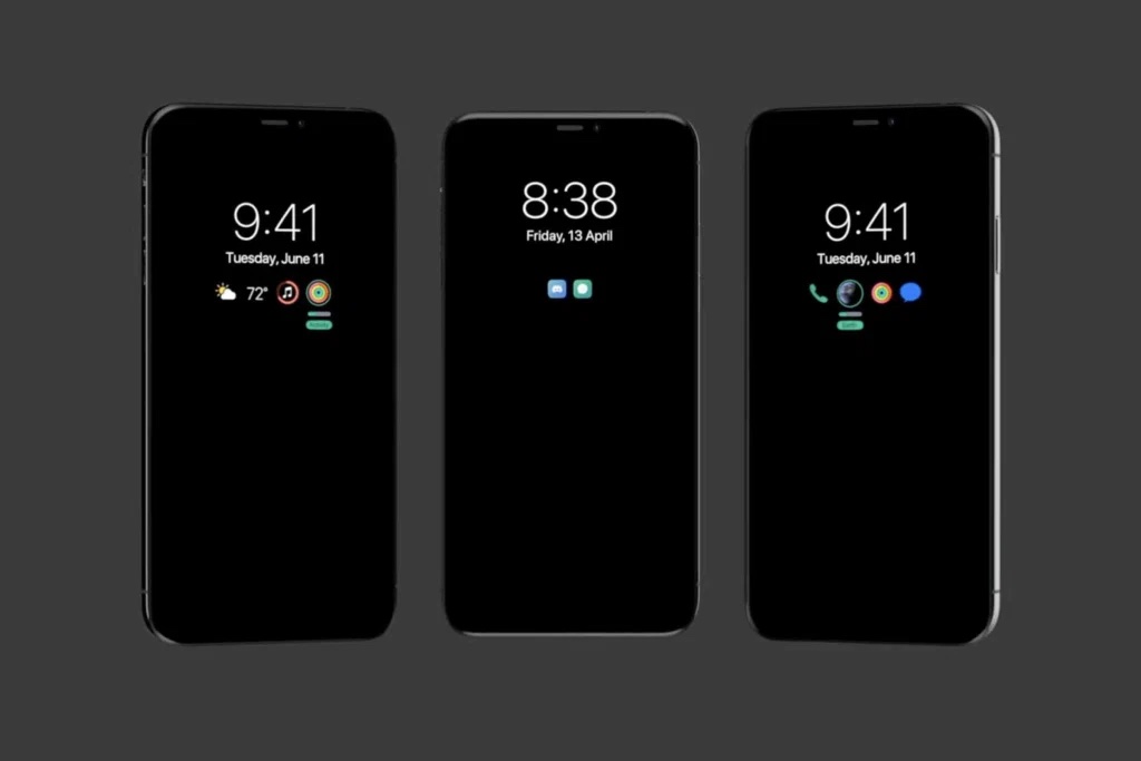
We’re going to keep asking for this until Apple relents. There’s no reason that every iPhone with an OLED display (which is multiple models over the last several years) couldn’t have some useful information displayed at all times. Android phones have had them forever.
At least, it should be an option. Users who are especially concerned about battery life or burn-in could disable it, though a smartly-designed always-on display wouldn’t bring much risk of either. Just ask Apple, who implemented an always-on display on Apple Watch, maybe its most battery-sensitive device.
I just want to be able to see the time, date, and weather, and get some sense of what important notifications are waiting for me by glancing over at the phone at my desk without even picking it up. That’s not too much to ask for in 2022.
EverythingApplePro
Lock screen improvements
With iOS 15, Apple tried to combat notification overload on the lock screen by condensing them into a “scheduled summary.” Combined with the new Focus modes that hide notifications during certain activities, the goal is to help keep you from getting overwhelmed by attention-seeking apps so often.
It’s a nice idea, but it’s almost worthless because it requires too much work to set up. Everything is opt-in, and users have to decide which apps belong in the summary, what their focus modes should be and how they should act, and so on. We’ve always been able to manage our notifications, but everyone just uses the defaults for everything.
I’d like to see Apple take a different approach to cleaning up the lock screen. Let users pull down the notification shade if they want to see notifications, and give the lock screen a simple notification count (tapping on it would also open the notification shade). Free up all that space for other useful data like the weather, battery levels for connected devices (your Apple Watch is below 20%!), or other simple information icons.
There are lots of potential ways to make the lock screen more useful, but the simple clock and notification list feels a bit like a relic of the past. Notifications have become weapons in an escalating battle for our attention, and I want Apple to give me a bulletproof vest.
Oh, and it wouldn’t be a bad idea to give us the option to change the flashlight and camera shortcuts to a curated list of other functions.
App Library redesign
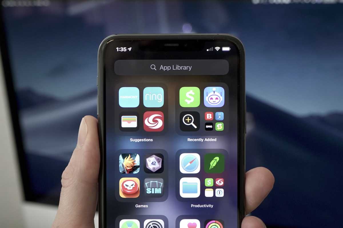
The App Library is a great idea. Introduced in iOS 14, it lets you remove your less-used apps from your various home screens without needing to physically remove them from your iPhone. But it’s sort of an unintuitive mess. It’s organized into rigid automatically managed folders by application type, and it doesn’t always put apps into the group you think it should.
Worse, the folders are displayed as large four-icon “quads” where three apps are icons (without labels) that open the app when tapped, but the fourth spot shows up to four other apps as tiny icons, and opens the folder when tapped. None of this is clear from the design.
Frankly, a simple alphabetical list, similar to what you get when tapping the search bar at the top of the App Library, would be a better view. At least give us the option to make an alphabetical list the default view, as was done on Apple Watch.
Beyond that, the entire auto-folder schema needs rethinking. It moves and shifts, which defies muscle memory about where things are. It’s got no labels. And it’s not clear what will open an app and what will expand the folder. The App Library tries so hard to be simple that it becomes confusing.
IDG
HomeKit overhaul / new Home app
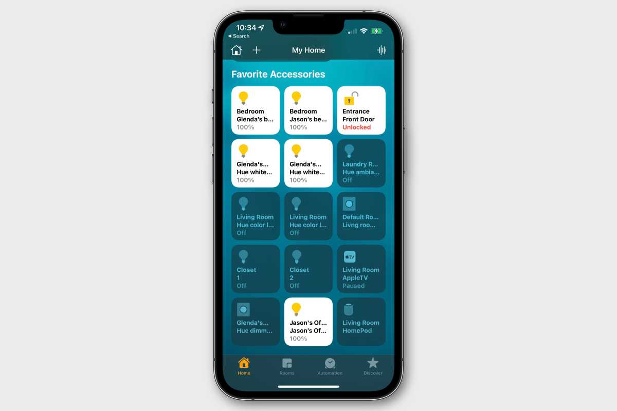
The Home app has sort of an antiquated look and lacks any sense of information hierarchy. The quick information and controls at the top are automatically chosen and can’t be edited, and every device, regardless of type, is represented by an identical square.
It’s not immediately clear, without experimentation, what happens when you tap on one of these squares and what you get when you long-press on it.
The Home app needs a rethinking, with different control types for different kinds of devices. A simple plug shouldn’t be represented and controlled the same way as your smart lighting, which shouldn’t be the same as a thermostat, which shouldn’t be the same as your HomePod.
And while it’s not an iOS 16 thing in particular, Apple needs to make a much bigger push with manufacturers to add HomeKit support, even outright paying them to do so if necessary. There are far too many smart home devices that only support Alexa or Google Assistant but aren’t compatible with HomeKit. Even if Apple convinced every new smart home gadget to support HomeKit, it would take several years for the playing field to level out.
IDG
More default app options
You can set a default email app or web browser on iPhone, and have been able to since iOS 14. That’s a good start, but it’s just that, a start.
We should be able to set default music and podcast apps, so when we ask Siri to play something we don’t have to specify the app name every time (or hope that it’ll remember). The same goes with messaging—let messaging apps have a framework to associate their user IDs with our system contacts so when I say “Hey Siri, message mom” it knows to use WhatsApp or whatever instead of Messages, if I have made the decision to change my default.
Apple could do more to provide default app options beyond just web browser and email apps while staying away from those that could compromise security. Calendar, Maps, and Weather are all good candidates.
Sideloading (ha!)
The debate over Apple’s App Store policies has been going on for years, and it’s not going to end any time soon.
On the Mac, Apple uses Gatekeeper and certificate signing to ensure apps don’t contain malicious code. Developers submit apps to Apple to be notarized, and then they can be distributed on the web in whatever manner the developer wants.
Something like this could work on iOS, too. Users would have to opt into installing apps from outside the app store, and would get appropriate warnings, of course. And apps would probably have to jump through more technical hurdles to be notarized than they do on the Mac—ensuring they use the proper frameworks for things like location access and such to ensure your iPhone privacy settings aren’t compromised.
In other words, Apple should notarize and allow the installation of any iPhone app that meets its technical, safety, and security rules, but keep that separate from the content rules that define App Store distribution.
Of course, none of this will ever happen until our laws demand it, so of course, there’s zero chance that Apple will allow any form of sideloading, even with restrictive notarization requirements, in iOS 16. But this is a wishlist, not a likely-to-happen list.
Siri improvements (again!)
To be fair, Apple made some really nice improvements to Siri in iOS 15. It finally got offline processing, which speeds things up a lot and improves privacy. It also got a bit smarter and more reliable and is a lot better about understanding what is on the screen and reacting to it.
But it’s still got so far to go. Not a day goes by that I don’t ask my Google Assistant something to which I get a good answer, and then—just out of curiosity—I ask Siri as well. Siri fails far too often.
Siri’s definitely getting better, it’s just not getting better fast enough.
2FA app integration
When you’re signing in to an app or a website and you get sent a two-factor authentication (2FA) code via text message, it populates the keyboard suggestion bar with the code. Just tap it to automatically type the code into your app/website, and away you go!
It’s a brilliant feature, one that saves time from hopping back and forth between the Messages app and trying to remember a string of numbers. But it’s limited to SMS-based codes, and that’s not always the most secure option. SIM-jacking, number rerouting services, and other attacks can compromise your SMS-based text messages.
I’d love for Apple to provide a framework for one-time-password code generation apps such as Authy, Google Authenticator, Step Two, and others so they can securely populate that same spot on the keyboard suggestions bar when an app or site requests a code.

Apple
Battery percentage in the status bar
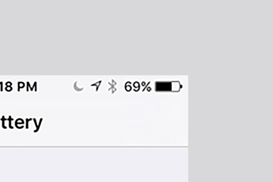
It’s the smallest thing. When we got Face ID, we lost a big chunk of the status bar, and Apple took away our ability to see our battery percentage. Sure, you can see it when you swipe down on Control Center, but who wants to do that?
I know it’s crowded up there with the TrueDepth module, but there’s got to be a simple way to let us see our battery percentage again, especially with rumors that the notch is going away with the iPhone 14 Pro.
IDG
Call screening
Here’s one last item from a reader: On Pixel phones, Google Assistant can be used to screen unknown calls and find out who’s calling before you pick up or send it to voicemail. With the rise in robocalls, it’s a fantastic feature and it would a great if Apple could get Siri to do the same.
Apple offers a feature in iOS 15 that lets you silence unknown numbers, but there are plenty of times when we miss actual calls instead. With Siri and a Call Screen-like feature, we wouldn’t have to worry about that anymore.
from Macworld.com https://ift.tt/2XHABJG
via IFTTT