Inside of Apple are two wolves…
Okay, I’m only sort of kidding. But it’s true that there’s long been an internal conflict within the company that reaches into its very soul.
On the one side is that intrinsic philosophy, trotted out at many a keynote presentation, about how the company loves to surprise and delight its users. That’s embodied in way that Apple creates solutions to problems that users didn’t even know they had. And when it works, it’s truly incredible: Apple’s best products, like the iPhone and the original Mac, are direct end results of this kind of creativity.
But there’s a dark flip-side to this ideal for which Apple is no less well-known: the “Apple knows best” dogma. It’s often compounded with the company’s fixation on form over function, or with its practice of providing only one way to do something. It’s the side of Apple that seems to think that its products would be perfect, if only it didn’t have to deal with those pesky users all the time.
These two things exist on a continuum and Apple’s behavior over the years has often been pendulum-like, swinging back and forth between the extremes, while never totally abandoning either side. In recent years, there have been definite indications that the company has swung towards that platonic ideal of a product extreme, but if Apple’s latest products are any indication, the pendulum is now firmly heading in the opposite direction, once again bringing the surprise and delight.
Putting the I/O in Studio
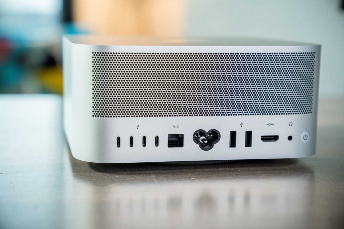
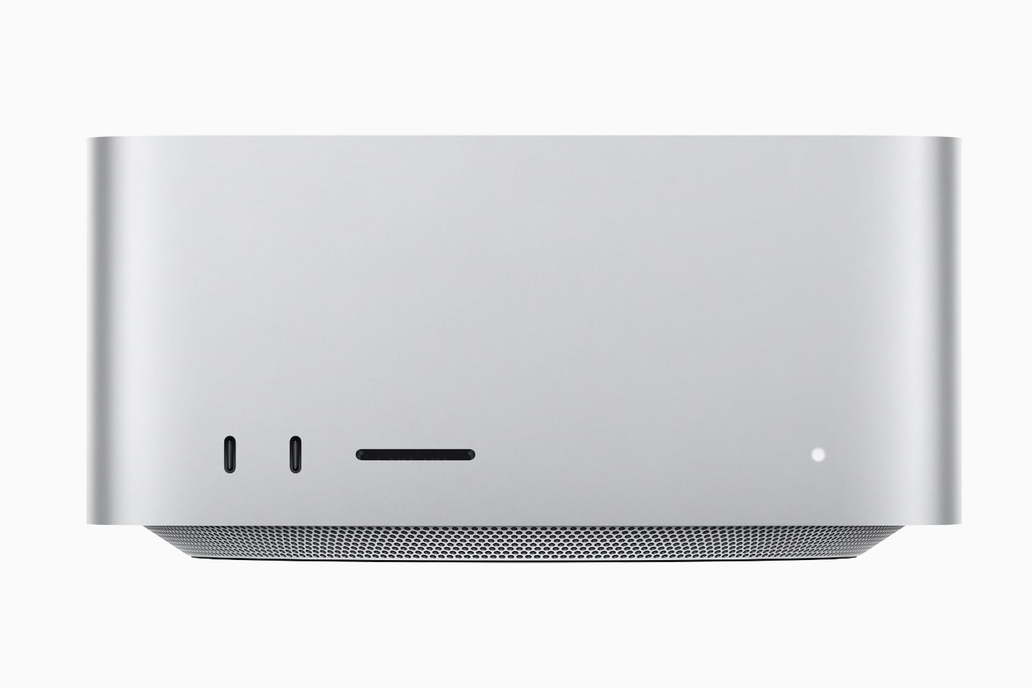
At times, the new Mac Studio seems like a product willed into existence by a certain cadre of Apple’s most devoted users. For years, the idea of a “mid-range desktop Mac” (sometimes dubbed the xMac) had been the holy grail of those users: a powerful desktop that didn’t have a built-in display like the iMac, but didn’t cost an arm and a leg like the Mac Pro. And with the Mac Studio, Apple at long last delivered.

The Mac Studio is the xMac we’ve been longing for.
Willis Lai/Foundry
That, in itself, is notable. Could Apple have made this Mac—or a version of it—at some point in the past two decades? Perhaps. The transition to the company’s own processors almost certainly eased the design process of the Mac Studio, diminishing the tradeoffs that might have been required with Intel’s famously power-hungry chips. (A louder, more powerful cooling system, for example.) But the fact that the company chose to produce this product now speaks to its renewed willingness to listen to what its customers want.
Likewise, the design of the Mac Studio reinforces that point: it screams utilitarian from every angle. From front-mounted USB ports and an SD card slot to the inclusion of USB-A and HDMI ports, it’s clear that the Mac Studio aims to satisfy customers who were left wanting by the company’s insistence that Macs have a minimal number of ports and prioritize clean, pristine lines over, say, not having to reach behind it to plug in a thumb drive.
The Mac Studio clearly embodies that old Steve Jobs philosophy that design isn’t about how something looks, but how it works.
Now displaying
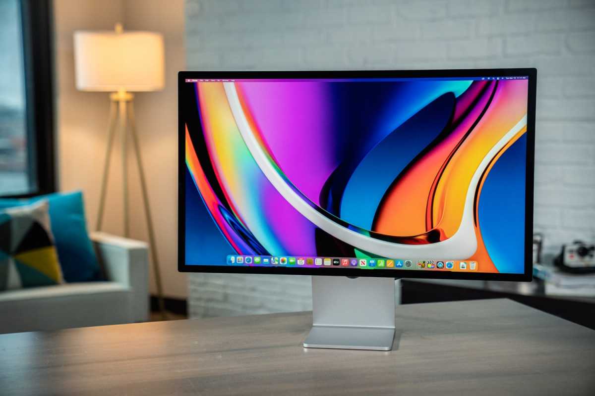
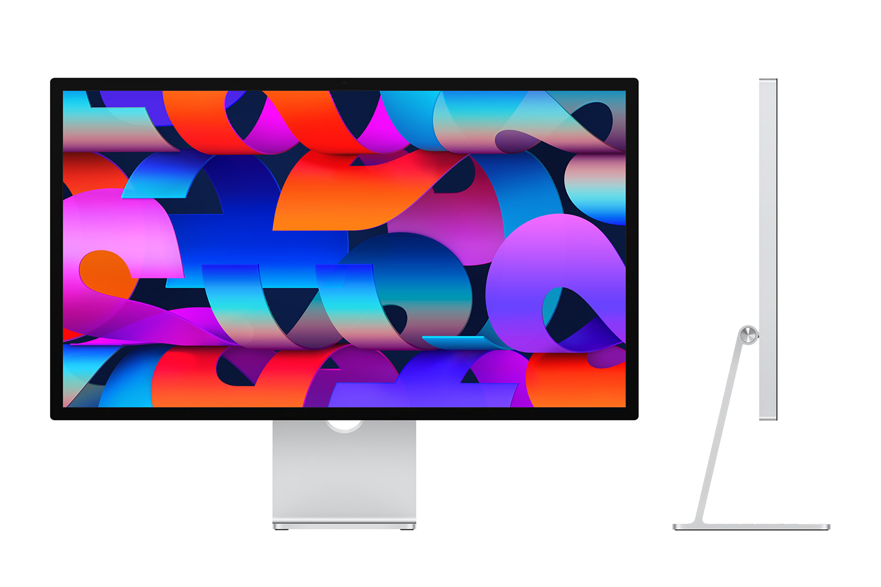
The Mac Studio wasn’t the only long-awaited product that Apple delivered this month. After years of abandoning the external display market to underwhelming third-party options, Apple dove back in with the Pro Display XDR in 2019. But, like the Mac Pro it accompanied, the XDR was a high-priced option targeted at true professionals, not your average power user. Instead, those users fixated on the idea of a lower-priced display using the same panel featured prominently in the 27-inch iMac.
And lo and behold, that’s exactly what they got with the Apple Studio Display—in some cases, to their dismay.
The Studio Display isn’t as clear-cut a case of that pendulum swing as the Mac Studio is; there are plenty of decisions that clearly reflect an “our way or the highway” ethos in this product, from the lack of true HDR support to the inclusion of a Center Stage camera. Apple made its tradeoffs, and they weren’t always the same ones that users wanted.
One example is the default stand, which comes at a single height. Surely a company as focused on health as Apple would know that ergonomically there’s no way that one size fits all when it comes to monitor height. And indeed, the company does know that, because it sells a height-adjustable stand as a $400 add-on. To be fair, that does seem like a decision made more out of a desire to protect profit margins than purely to impose its design vision, but as with the 24-inch iMac before it, the company seems intent on holding to the line that this is the best option—accept no substitutes. (Unless you want to pay $400.)
In the end, the Studio Display is mostly what users have been asking for—both for better and for worse.

Willis Lai/Foundry
In the swing of things
The real question, to my mind, is whether that pendulum is still in mid-swing, or is on its way back towards the form-over-function extreme. My inclination is to say the former: Apple’s still recovering from some of its more egregious design decisions of the last few years, such as abandoning non-USB-C ports on its laptops and the extremely unpopular butterfly keyboards. Not only did users raise a stink about those things, but they ended up making their way into the zeitgeist, reinforcing an age-old view of an Apple that doesn’t listen to its users.
But other data points are in the offing. All eyes are on the company’s update to the Mac Pro, which it teased at the end of its March event. Apple’s most powerful desktop isn’t its biggest seller, but it does set the tone for how it deals with some of its most insistent users.
And as the company’s annual Worldwide Developers Conference approaches, many are waiting to see what this year’s major software platforms updates will bring: solutions in search of problems, or innovations that, yes, surprise and delight.
Mac Studio M1 Max (2022)

from Macworld.com https://ift.tt/x6gs2TI
via IFTTT


0 Comments